Shopify V2 Integration Guide
This section shows how to add Kleep AI Sizing to your Shopify Store.Step-by-step video walkthrough
Follow our Tango tutorial to add the Kleep button to your shop on Online Store 2.0 themes.
Shopify V1 Integration Guide
1. Sizing
This section shows how to add Kleep AI Sizing to your Shopify codebase.Prefer a visual walkthrough?
Watch the step-by-step Tango tutorial for installing Kleep on a Shopify V1 store.
Steps
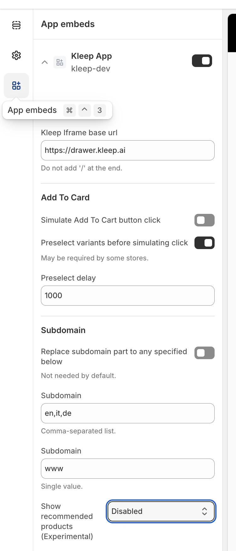
Step 1: Enable the App Embed Make sure that the Kleep app is activated in your App embeds.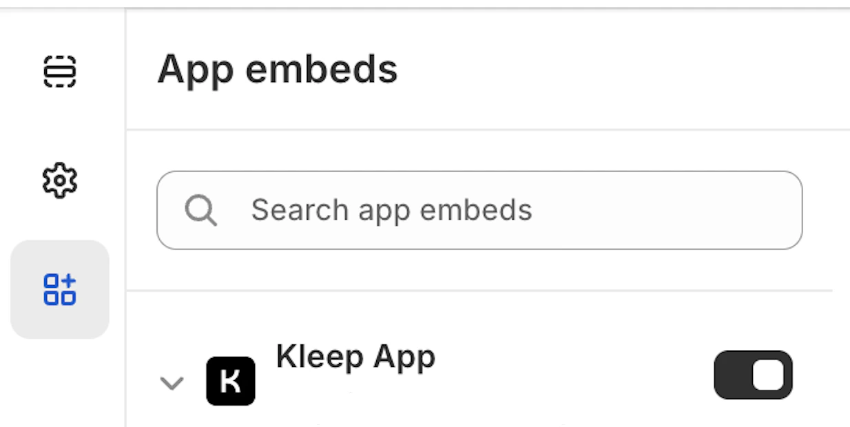
Product info block within the snippets folder.
kleep-button.liquid within your snippets folder. Put the following content inside:
Kleep button
Kleep button
Shopify options
Shopify options
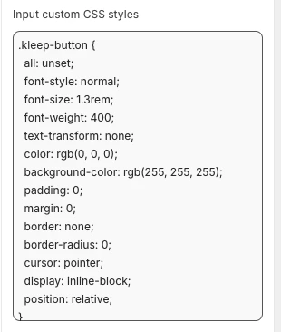
- To change how it looks (colors, spacing, fonts, etc.), paste your CSS into the “Input custom CSS styles” box in the Kleep App Embed settings.
Translations
Translations
fr.json
fr.json
it.json
it.json
de.json
de.json
es.json
es.json
ja.json
ja.json
ko.json
ko.json
pt.json
pt.json
- Validate updates in the Shopify Theme Customize area. Configure visuals within product information block settings.
- If you want to add secondary button you will need to create a new file named
kleep-secondary-button.liquidwithin yoursnippetsfolder. Put the following content inside:
Secondary button code
Secondary button code
Product info block within snippets folder.
Render snippet
Render snippet
2. Similar Products
Install “Similar Products” for V1 Shopify Themes
In this case, you must add a Liquid snippet manually.Step 1 - Create a snippet
Create:snippets/kleep-similar-button.liquid
Insert the following code:
Similar button snippet
Similar button snippet
Step 2 - Render the snippet inside the product template
Insert this line wherever you want the button to appear:Render snippet
Render snippet
Step 3 - Enable the correct mode for V1 themes
Because V1 themes cannot insert OS2.0 blocks, the widget must use one of:custom_buttonspopup+custombutton+custom
Install “Similar Products” for V2 (Online Store 2.0) Stores
Modern Shopify themes support app embeds and custom blocks. No code changes are required.Step 1 — Enable the Kleep App Embed
- Go to Online Store → Themes → Customize.
- Open the App embeds section.
- Enable the Kleep App.
- Save the theme.
Step 2 — Select the Similar Products display mode
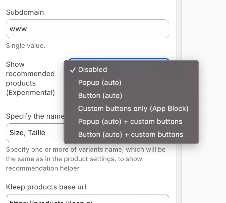
Inside the Kleep widget configuration, choose how Similar Products should appear on the Product Page:- disabled – completely turns off the feature
- popup – automatically adds a popup above variant/size selectors on desktop, and replaces the default button on mobile
- button – automatically inserts a CTA button near the Add to Cart area when the selected variant is out of stock
- custom_buttons – disables all automatic placement; the merchant must add one or more “Kleep Similar Button” blocks manually
- popup+custom – keeps the automatic popup and also enables any custom buttons added in the theme
- button+custom – keeps the automatic CTA button and also enables any custom buttons added in the theme
- Open Online Store → Customize.
- Go to the Product page template.
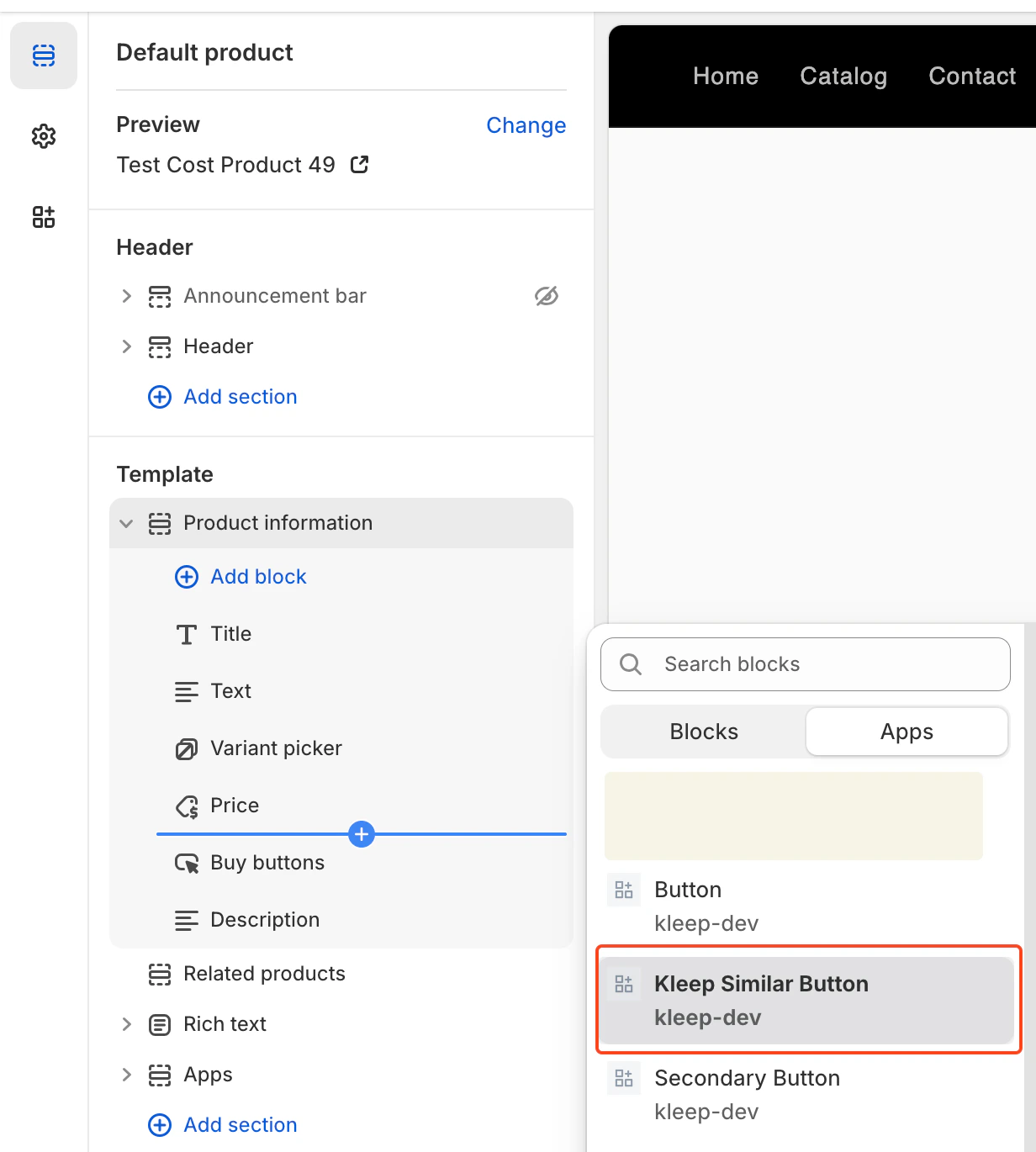
- In the desired section, click Add Block.
- Select Kleep Similar Button.
- Save the theme.
Adding Multiple “Similar Products” Buttons (Primary & Secondary)
You can add any number of Similar Products buttons on the Product Page. This works for both OS 2.0 themes and V1 / legacy themes.Enable a Mode That Supports Custom Buttons
To allow multiple buttons, the widget must be set to one of:- custom_buttons
- popup+custom
- button+custom
For Online Store 2.0 (Modern Themes)
OS 2.0 themes allow adding buttons visually through the Theme Editor. Steps:- Go to Online Store → Customize
- Open the Product page template
- Click Add block → Kleep Similar Button
- Add the button anywhere you want
- Repeat if you want 2+ buttons on the page
For V1 / Legacy Themes
Legacy themes do not support blocks, but you can render the snippet multiple times. Insert this snippet wherever you want a button:{% render 'kleep-similar-button' %}
To create multiple buttons, simply place this code in different areas of the product template.
Each snippet call creates an additional button.
Summary
To add multiple Similar Products buttons: Enable any mode with custom buttons → add several OS 2.0 blocks or multiple snippet calls → all buttons work automatically when the variant is out of stock.CTA Location on PDP The location is defined by DOM selectors inside
KleepSDK.getConstants().
targetProductInfoBlockQueries – where the product info is. This is an array of selectors that point to the main container of product details (title, price, sizes, etc.).The script iterates through these selectors and uses the first one it finds as the insertion point for the CTA or popups.
targetVariantQueries – where size/variant options are:Once the product info block is found, the script searches inside it for variant elements (like size selectors).Each variant <label> (or equivalent) becomes a target for attaching the popup CTA.
Popup vs. Button (Desktop vs. Mobile)
We detect the device type using checkIfMobile():
This function checks the browser’s navigator.userAgent string against a list of mobile devices (e.g., iPhone, Android, iPad).
- If desktop, the CTA is displayed as hover popups next to the variant labels.
- If mobile, the script replaces hover popups with a single button, since hover interactions do not work on touch screens.
- Other variants of placement/layout are not provided beyond adjusting the selectors and CSS.
-
To change how it looks (colors, spacing, fonts, etc.), paste your CSS into the “Input custom CSS styles” box in the Kleep App Embed settings.
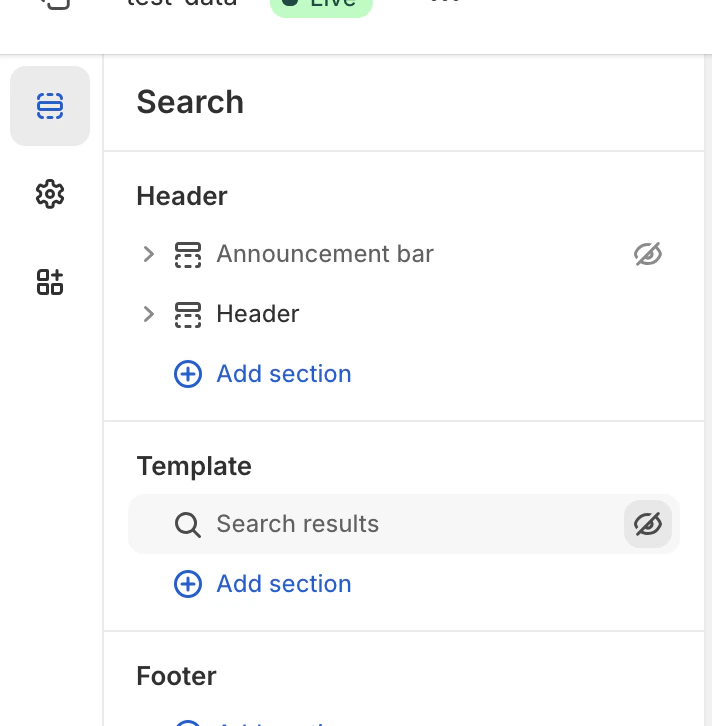
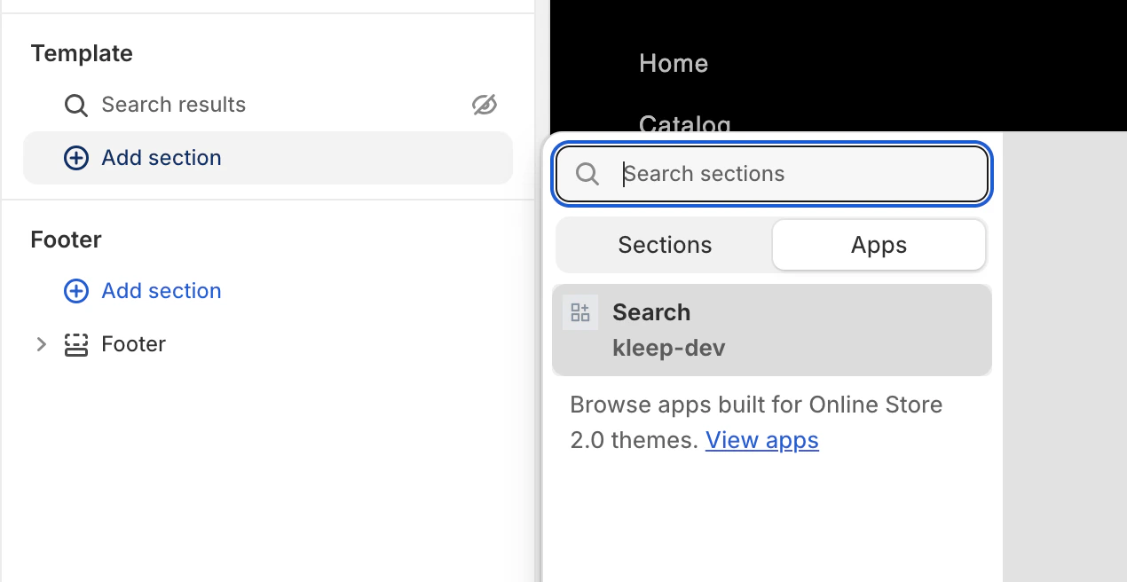
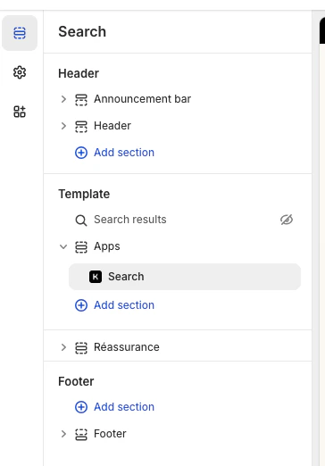
3. Search
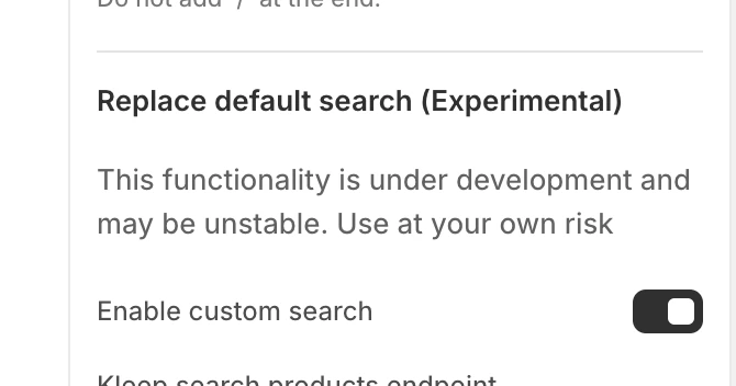
Note: You don’t need to change any theme code to set up the Kleep Search in Shopify V1. Open the Theme Editor, turn on the Kleep App Embed, enable Custom Search, then replace the default search block with the Kleep Search block. To change how it looks (colors, spacing, fonts, etc.), paste your CSS into the “Input custom CSS styles” box in the Kleep App Embed settings. All of this things will be discribe below Open Theme Editor Go to Online Store > Themes, find the theme you want to edit, and click Customize. Enable Kleep App Embed Open the App embeds section. Find the Kleep app and switch it on. Enable Custom Search (Optional) In the Kleep settings, enable “Enable custom search”.
{% if block.settings.kleep_enable_custom_search and '[kookai.fr](http://kookai.fr/), [gualap.com](http://gualap.com/), [gualap.fr](http://gualap.fr/), [www.molli.com](http://www.molli.com/), [getkleep.myshopify.com](http://getkleep.myshopify.com/)' contains domain%}
This ensures only specific stores (domains) can enable the search feature.Layout and Styles
- Grid vs. list view is toggled only through the products_search_grid_layout setting in the app.
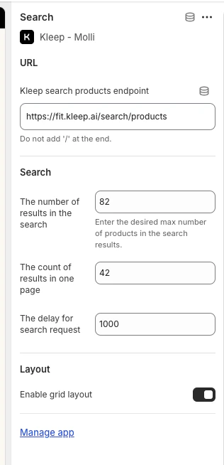
- Additional styles (fonts, colors, spacing) are implemented by us in the code, on a per-store basis, if needed.
-
All functionality is tied to this Liquid section and enabled via
kleep_enable_custom_searchin the app, not by adding Liquid code to the theme settings. -
To change how it looks (colors, spacing, fonts, etc.), paste your CSS into the “Input custom CSS styles” box in the Kleep App Embed settings.