Shopify V2 통합 가이드
이 섹션에서는 Shopify 스토어에 Kleep AI 사이즈 추천을 추가하는 방법을 설명합니다.단계별 동영상 가이드
Tango 튜토리얼을 따라 Online Store 2.0 테마에서 Kleep 버튼을 쇼핑몰에 추가하세요.
Shopify V1 통합 가이드
1. 사이즈 추천
이 섹션에서는 Shopify 코드베이스에 Kleep AI 사이즈 추천을 추가하는 방법을 설명합니다.시각적 가이드를 선호하시나요?
Shopify V1 스토어에 Kleep을 설치하는 단계별 Tango 튜토리얼을 시청하세요.
단계
1단계: 앱 임베드 활성화 앱 임베드에서 Kleep 앱이 활성화되어 있는지 확인하세요.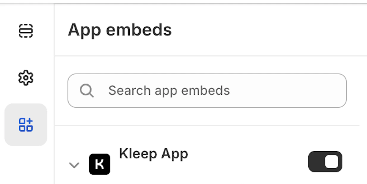
snippets 폴더 내 Product info 블록의 일부여야 합니다.
snippets 폴더 내에 kleep-button.liquid라는 새 파일을 생성하세요. 다음 내용을 파일에 추가하세요:
Kleep 버튼
Kleep 버튼
Shopify 옵션
Shopify 옵션
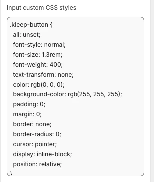
- 외관(색상, 간격, 폰트 등)을 변경하려면 Kleep 앱 임베드 설정의 “Input custom CSS styles” 상자에 CSS를 붙여넣으세요.
번역
번역
fr.json
fr.json
it.json
it.json
de.json
de.json
es.json
es.json
ja.json
ja.json
ko.json
ko.json
pt.json
pt.json
- Shopify 테마 커스터마이즈 영역에서 업데이트를 확인하세요. 상품 정보 블록 설정에서 시각적 요소를 구성하세요.
- 보조 버튼을 추가하려면
snippets폴더 내에kleep-secondary-button.liquid라는 새 파일을 생성해야 합니다. 다음 내용을 파일에 추가하세요:
보조 버튼 코드
보조 버튼 코드
snippets 폴더 내 Product info 블록의 일부여야 합니다.
스니펫 렌더링
스니펫 렌더링
2. 유사 상품
V1 Shopify 테마를 위한 “유사 상품” 설치
이 경우, Liquid 스니펫을 수동으로 추가해야 합니다.1단계 - 스니펫 생성
생성:snippets/kleep-similar-button.liquid
다음 코드를 삽입하세요:
유사 버튼 스니펫
유사 버튼 스니펫
2단계 - 상품 템플릿 내 스니펫 렌더링
버튼이 표시되길 원하는 위치에 이 줄을 삽입하세요:스니펫 렌더링
스니펫 렌더링
3단계 - V1 테마를 위한 올바른 모드 활성화
V1 테마는 OS2.0 블록을 삽입할 수 없으므로 위젯은 다음 중 하나를 사용해야 합니다:custom_buttonspopup+custombutton+custom
V2(Online Store 2.0) 스토어를 위한 “유사 상품” 설치
최신 Shopify 테마는 앱 임베드와 커스텀 블록을 지원합니다. 코드 변경이 필요하지 않습니다.1단계 — Kleep 앱 임베드 활성화
- 온라인 스토어 → 테마 → 커스터마이즈로 이동하세요.
- 앱 임베드 섹션을 여세요.
- Kleep 앱을 활성화하세요.
- 테마를 저장하세요.
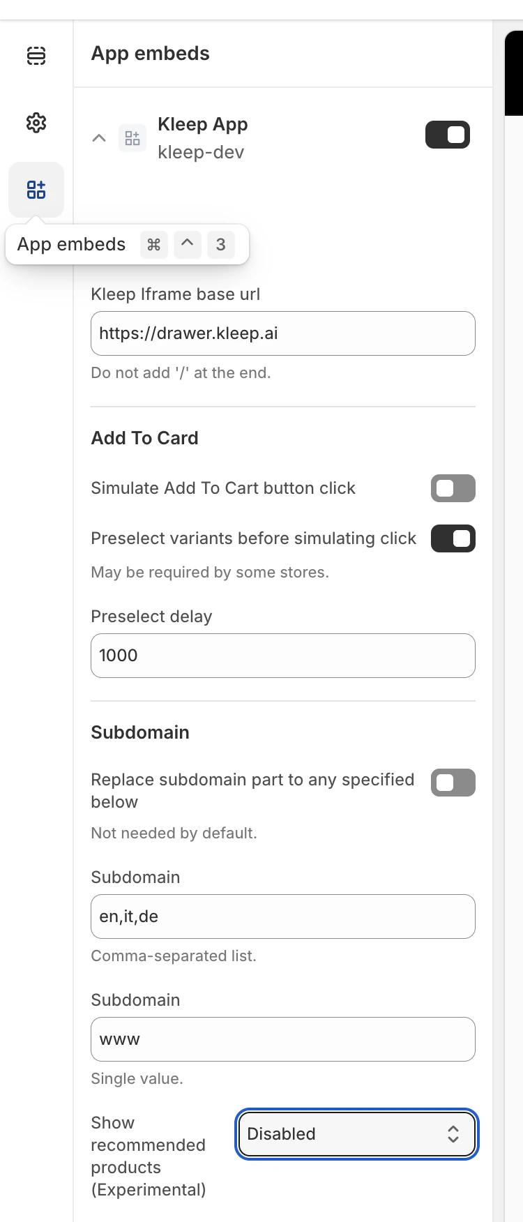
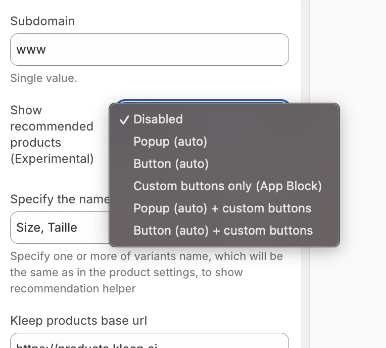
2단계 — 유사 상품 표시 모드 선택
Kleep 위젯 구성 내에서 상품 페이지에 유사 상품이 표시되는 방식을 선택하세요:- disabled – 기능을 완전히 끕니다
- popup – 데스크톱에서 변형/사이즈 선택기 위에 팝업을 자동으로 추가하고, 모바일에서는 기본 버튼을 대체합니다
- button – 선택된 변형이 품절일 때 장바구니에 추가 영역 근처에 CTA 버튼을 자동으로 삽입합니다
- custom_buttons – 모든 자동 배치를 비활성화합니다; 판매자가 하나 이상의 “Kleep Similar Button” 블록을 수동으로 추가해야 합니다
- popup+custom – 자동 팝업을 유지하고 테마에 추가된 모든 커스텀 버튼도 활성화합니다
- button+custom – 자동 CTA 버튼을 유지하고 테마에 추가된 모든 커스텀 버튼도 활성화합니다
- 온라인 스토어 → 커스터마이즈를 여세요.
- 상품 페이지 템플릿으로 이동하세요.
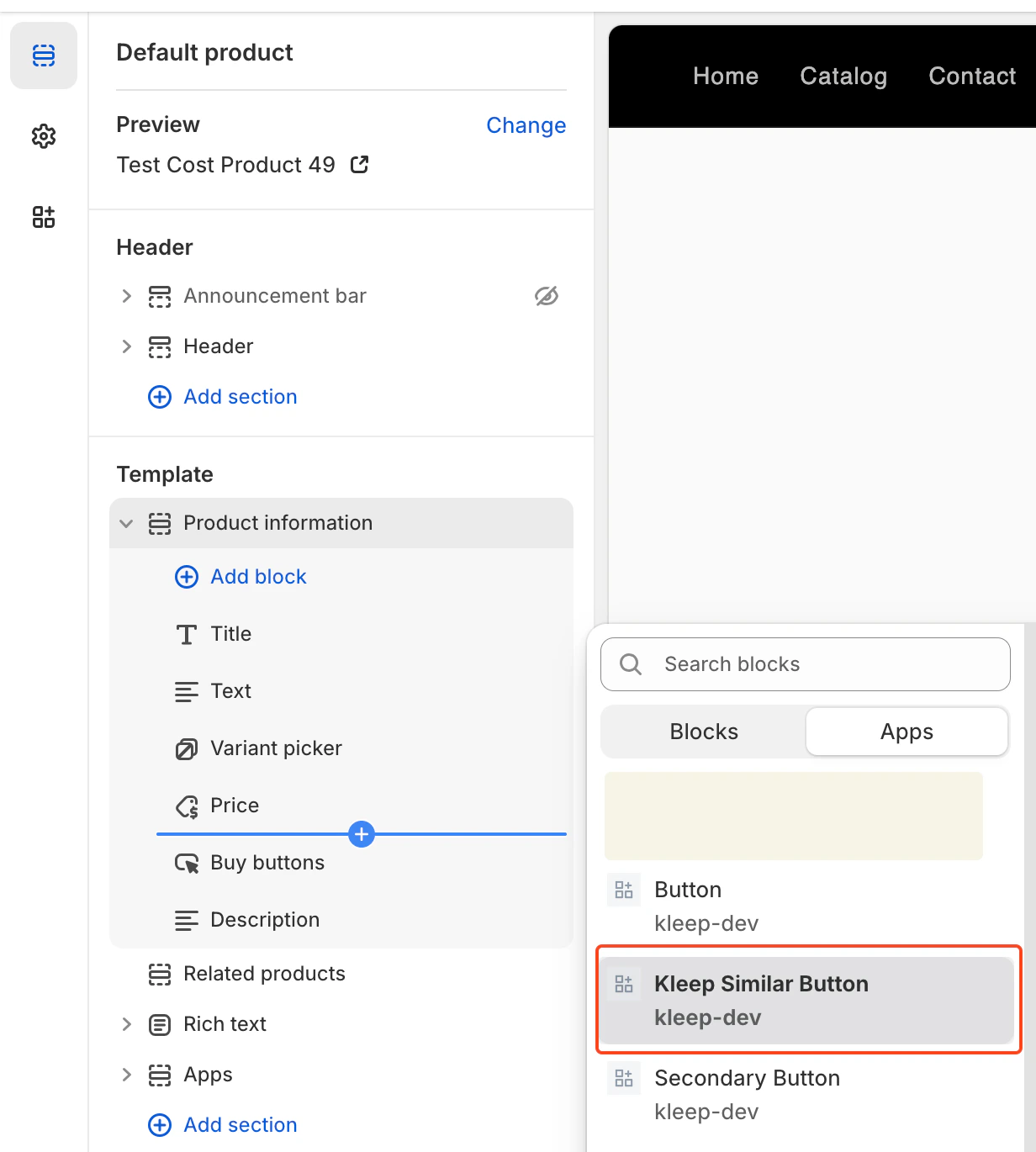
- 원하는 섹션에서 블록 추가를 클릭하세요.
- Kleep Similar Button을 선택하세요.
- 테마를 저장하세요.
여러 “유사 상품” 버튼 추가 (기본 및 보조)
상품 페이지에 유사 상품 버튼을 원하는 수만큼 추가할 수 있습니다. OS 2.0 테마와 V1 / 레거시 테마 모두에서 작동합니다.커스텀 버튼을 지원하는 모드 활성화
여러 버튼을 허용하려면 위젯을 다음 중 하나로 설정해야 합니다:- custom_buttons
- popup+custom
- button+custom
Online Store 2.0 (최신 테마)용
OS 2.0 테마는 테마 편집기를 통해 시각적으로 버튼을 추가할 수 있습니다. 단계:- 온라인 스토어 → 커스터마이즈로 이동
- 상품 페이지 템플릿 열기
- 블록 추가 → Kleep Similar Button 클릭
- 원하는 위치에 버튼 추가
- 페이지에 2개 이상의 버튼을 원하면 반복
V1 / 레거시 테마용
레거시 테마는 블록을 지원하지 않지만 스니펫을 여러 번 렌더링할 수 있습니다. 버튼을 원하는 위치에 이 스니펫을 삽입하세요:{% render 'kleep-similar-button' %}
여러 버튼을 생성하려면 이 코드를 상품 템플릿의 다른 영역에 배치하세요.
각 스니펫 호출은 추가 버튼을 생성합니다.
요약
여러 유사 상품 버튼을 추가하려면: 커스텀 버튼이 있는 모드를 활성화하고 → 여러 OS 2.0 블록 또는 다수의 스니펫 호출을 추가하세요 → 변형이 품절이면 모든 버튼이 자동으로 작동합니다.PDP의 CTA 위치 위치는
KleepSDK.getConstants(). 내의 DOM 셀렉터로 정의됩니다.
targetProductInfoBlockQueries – 상품 정보가 있는 위치. 상품 세부 정보(제목, 가격, 사이즈 등)의 메인 컨테이너를 가리키는 셀렉터 배열입니다. 스크립트는 이 셀렉터들을 반복하여 CTA 또는 팝업의 삽입 지점으로 첫 번째 발견된 것을 사용합니다.
targetVariantQueries – 사이즈/변형 옵션이 있는 위치: 상품 정보 블록이 발견되면 스크립트는 그 안에서 변형 요소(사이즈 선택기 등)를 검색합니다. 각 변형 <label>(또는 동등한 것)이 팝업 CTA를 연결하는 대상이 됩니다.
팝업 vs. 버튼 (데스크톱 vs. 모바일)
checkIfMobile()을 사용하여 기기 유형을 감지합니다:
이 함수는 브라우저의 navigator.userAgent 문자열을 모바일 기기 목록(예: iPhone, Android, iPad)과 비교합니다.
- 데스크톱의 경우 변형 레이블 옆에 호버 팝업으로 CTA가 표시됩니다.
- 모바일의 경우 터치 스크린에서 호버 상호작용이 작동하지 않으므로 스크립트는 호버 팝업을 단일 버튼으로 대체합니다.
- 셀렉터 및 CSS 조정 외에 다른 배치/레이아웃 변형은 제공되지 않습니다.
-
외관(색상, 간격, 폰트 등)을 변경하려면 Kleep 앱 임베드 설정의 “Input custom CSS styles” 상자에 CSS를 붙여넣으세요.
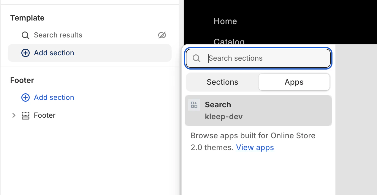
3. 검색
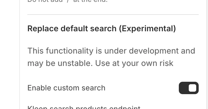
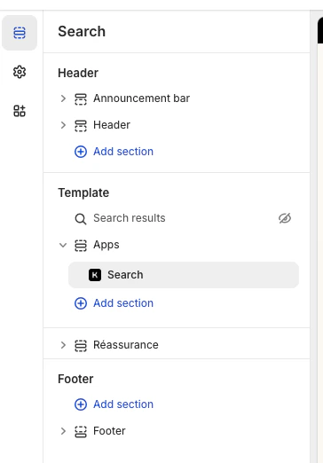
참고: Shopify V1에서 Kleep 검색을 설정하기 위해 테마 코드를 변경할 필요가 없습니다. 테마 편집기를 열고 Kleep 앱 임베드를 켜고 커스텀 검색을 활성화한 다음 기본 검색 블록을 Kleep 검색 블록으로 교체하세요. 외관(색상, 간격, 폰트 등)을 변경하려면 Kleep 앱 임베드 설정의 “Input custom CSS styles” 상자에 CSS를 붙여넣으세요. 이 모든 내용은 아래에 설명되어 있습니다 테마 편집기 열기 온라인 스토어 > 테마로 이동하여 편집하려는 테마를 찾고 커스터마이즈를 클릭하세요. Kleep 앱 임베드 활성화 앱 임베드 섹션을 여세요. Kleep 앱을 찾아 켜세요. 커스텀 검색 활성화 (선택 사항) Kleep 설정에서 “커스텀 검색 활성화”를 활성화하세요.
{% if block.settings.kleep_enable_custom_search and '[kookai.fr](http://kookai.fr/), [gualap.com](http://gualap.com/), [gualap.fr](http://gualap.fr/), [www.molli.com](http://www.molli.com/), [getkleep.myshopify.com](http://getkleep.myshopify.com/)' contains domain%}
이를 통해 특정 스토어(도메인)만 검색 기능을 활성화할 수 있습니다. 레이아웃 및 스타일
- 그리드 vs. 목록 보기는 앱의 products_search_grid_layout 설정을 통해서만 전환됩니다.
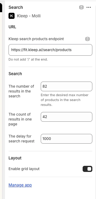
- 추가 스타일(폰트, 색상, 간격)은 필요한 경우 스토어별로 코드에서 구현됩니다.
-
모든 기능은 이 Liquid 섹션에 연결되어 있으며 테마 설정에 Liquid 코드를 추가하는 것이 아닌 앱의
kleep_enable_custom_search를 통해 활성화됩니다. -
외관(색상, 간격, 폰트 등)을 변경하려면 Kleep 앱 임베드 설정의 “Input custom CSS styles” 상자에 CSS를 붙여넣으세요.