> ## Documentation Index
> Fetch the complete documentation index at: https://docs.kleep.ai/llms.txt
> Use this file to discover all available pages before exploring further.
# Shopify Integration Guide
**This guide walks you through installing Kleep on your Shopify store. Kleep offers three main features: an intelligent size guide (Kleep Sizing), similar product recommendations (Kleep Similar Products), and an optimised product search (Kleep Search).**
## Integration Process Overview
Here's what to expect from contract signing through go-live and beyond. The end-to-end integration typically takes around **5–6 weeks**.
### Onboarding
Once the contract is signed, your Kleep representative kicks off billing via GoCardless: [Set up direct debit →](https://pay.gocardless.com/BRT000352V7T67Q).
A short call with your Kleep representative to align on timeline, technical contacts, and any store-specific requirements before installation begins.
After the kickoff, we'll ask you to share a few details about your company, billing, store environments, and returns setup so we can prepare the integration.
**[Fill out our onboarding form →](https://ihu3s9tz3r8.typeform.com/to/fYQw9zJ5)**
It takes about 5 minutes. Once submitted, our team will review your responses and confirm the next steps within 1 business day.
Send us your store address (e.g. `your-store.myshopify.com`) along with your collaborator request code so we can request access to your store.
**Multiple Shopify stores?** If you have several Shopify instances (e.g. different regions or brands), please send us a collaborator code for **each shop** — we need one code per store.
Not sure where to find these? In your Shopify admin, go to **Settings → Users and permissions** — your `myshopify.com` URL is shown at the top, and the **Collaborator request code** is listed under the *Collaborators* section. See Shopify's help article on [collaborator accounts](https://help.shopify.com/en/manual/your-account/staff-accounts/collaborator-accounts) for more detail.
We'll send a collaborator access request from our Shopify Partner account. Approve it from **Settings → Users and permissions → Collaborators** in your Shopify admin.
Once we have collaborator access, we'll send you an app installation link **for each store**. You'll need to install the Kleep app separately on every Shopify store where you want Kleep enabled.
Review our suggested positions for the "Find my size" button and pick the one that fits your storefront: [CTA positioning Figma →](https://www.figma.com/design/DvsqgNPSjVPVPLjKV2efAY/KLEEP-CTA-POSITIONING-SUGGESTIONS?node-id=0-1\&p=f\&t=92MwlxQkzlfAYyk5-0).
### Installation & testing
Our team duplicates your current Shopify theme and installs Kleep on the duplicate, so your live storefront stays untouched while you test.
We send you a private preview link to test the integration end-to-end and share any feedback or adjustments needed.
Once you sign off, we publish Kleep on your live theme.
### Post-integration
We provision credentials for your team to access the [Kleep Dashboard](https://dashboard.kleep.ai), where you can monitor Kleep performance KPIs in real time.
We enable [Fit Feedback](/dashboard/fit-feedback) in your dashboard so your team can refine Kleep's size recommendations using real-world fitting data.
## 1. Functionalities
Kleep is integrated within your store by installing a custom app that was created beforehand. It allows to:
1. Add our CTA “Find my size” on your product pages
2. Customize its UI directly in the Theme Editor
Our app also creates automated flows of Products, Orders and Returns Data in order to stay up to date. These data are retrieved on a daily basis.
Upon installation, the app creates a WebPixel which is used to track multiple metrics from which we derive the ROI of the solution.
## 2. Similar Products Feature
Similar Products suggests alternative products when a size is out of stock. This feature increases conversions by offering relevant alternatives to customers.
**Available Display Modes**
| Mode | Description |
| ----------------------- | --------------------------------------------------------- |
| **Popup (auto)** | Automatic popup on size hover (desktop) / button (mobile) |
| **Button (auto)** | Automatic CTA button near cart when out of stock |
| **Custom buttons only** | You manually place buttons via the theme editor |
| **Popup + custom** | Automatic popup + additional custom buttons |
| **Button + custom** | Automatic button + additional custom buttons |
**Configuration**
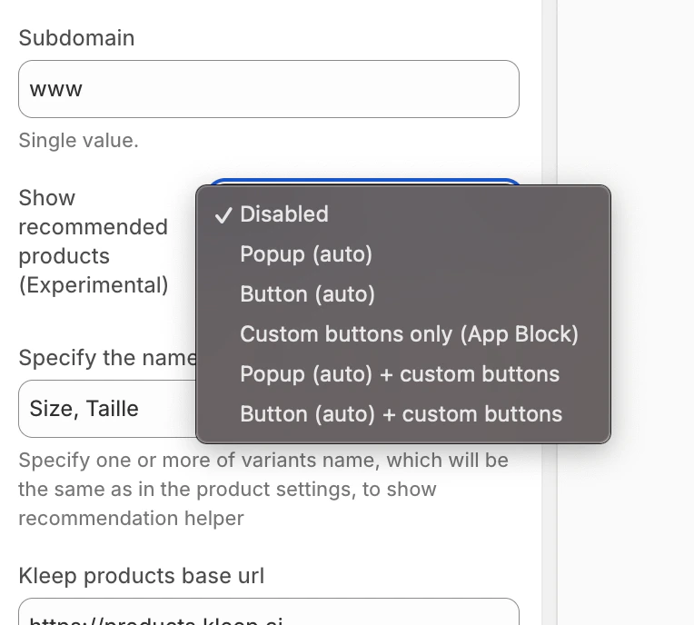
**Step 1: Choose the Display Mode**
In the Kleep App Embed settings, find the **“Show recommended products”** option and select your desired mode from the dropdown menu.
Similar Products Mode Selection
**Adding Custom Buttons (for custom modes)**
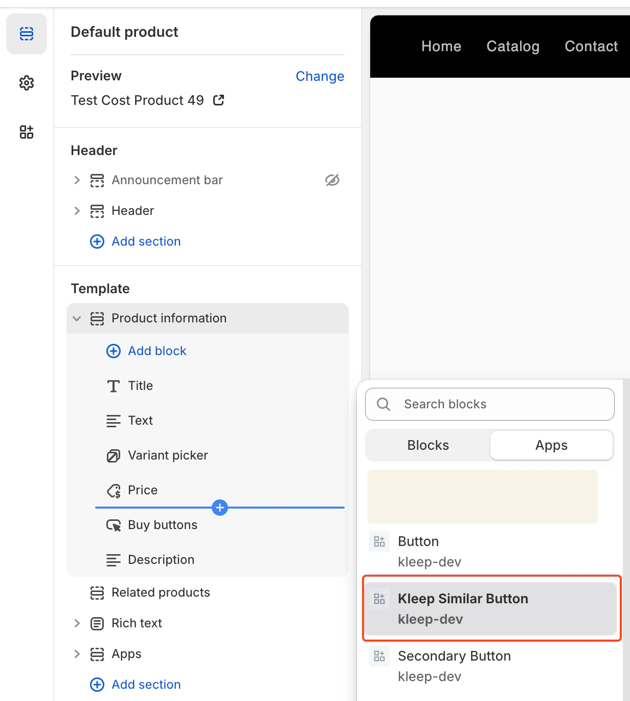
If you’ve chosen a mode with “custom”, you can add buttons at specific locations:
1. Go to the **Product page** template in the theme editor
2. In the desired section, click **Add block**
3. Click the **Apps** tab and select **“Kleep Similar Button”**
4. Position the block where you want it and save
Add Kleep Similar Button Block
Similar Products buttons only appear when a variant is out of stock. It’s normal if you don’t see them on all products.
**Adding Multiple Buttons**
You can add any number of Similar Products buttons on the Product Page. To allow multiple buttons, the widget must be set to one of: `custom_buttons`, `popup+custom`, or `button+custom`.
For OS 2.0 themes:
* Go to **Online Store → Customize**
* Open the **Product page** template
* Click **Add block → Kleep Similar Button**
* Repeat if you want 2+ buttons on the page
Every button automatically appears only when the selected variant is out of stock.
***
## 3. Kleep Search Feature
Kleep Search replaces the native Shopify search with an optimised search featuring size filters and personalised recommendations.
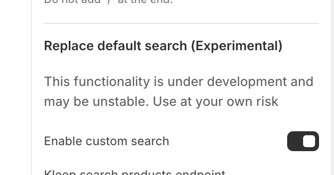
**Step 1: Enable Custom Search**
In the Kleep App Embed settings, enable the **“Enable custom search”** option.
Enable Custom Search
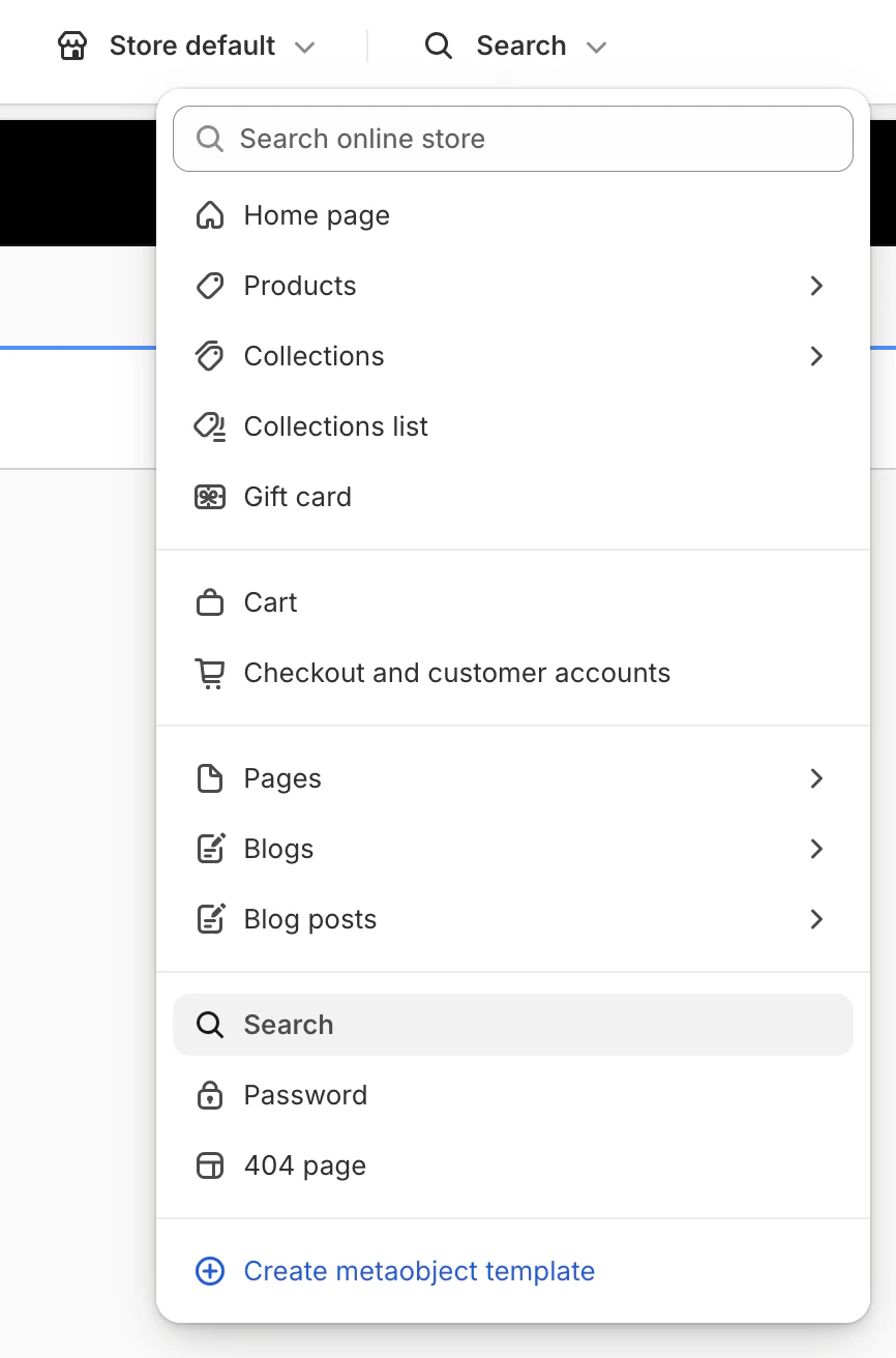
**Step 2: Access the Search Template**
In the theme editor, click the dropdown menu at the top (defaults to “Home page”) and select **“Search”** from the template list.
Select Search Template
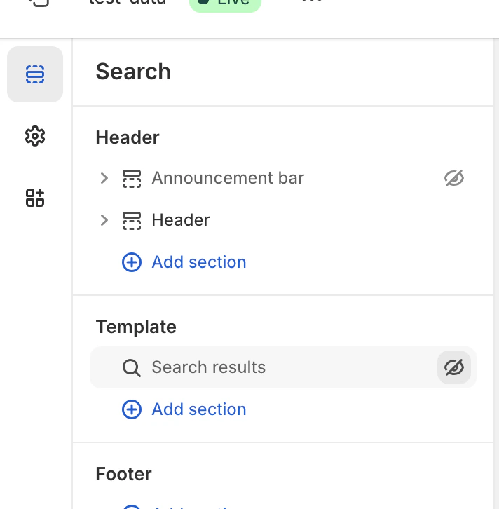
**Step 3: Hide the Native Search**
In the Template section, hide or remove the native **“Search results”** block by clicking the eye icon.
Hide Native Search
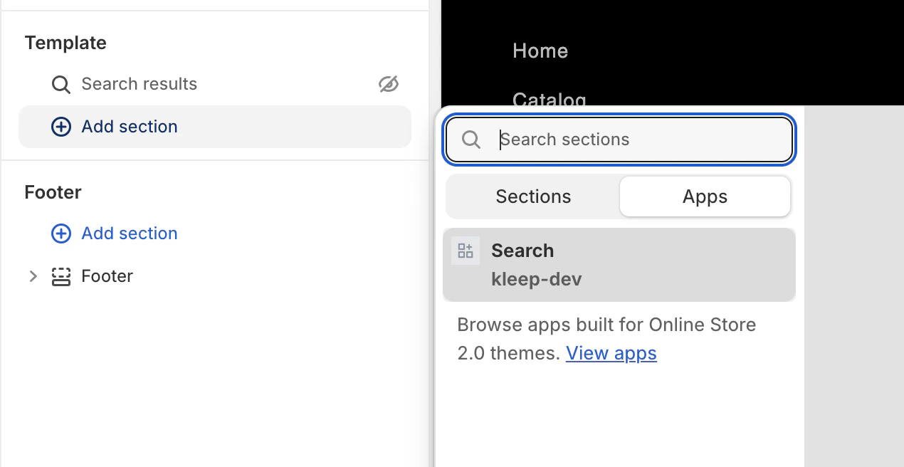
**Step 4: Add the Kleep Search Block**
Click **Add section**, then in the **Apps** tab, select **“Search”** (kleep-dev).
Add Kleep Search Block
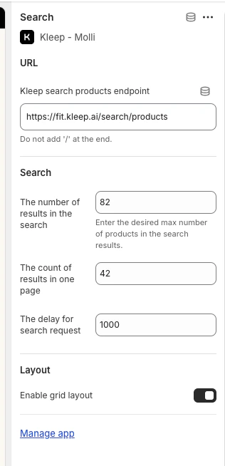
**Step 5: Configure Options**
Click the Search block you added to access settings: number of results, grid/list display, search delay, etc.
Search Configuration Options
## 4. Returns Integration (Optional)
If you use a returns management platform, Kleep can integrate return data to improve size recommendations.
**Supported Returns Providers**
* Global-e
* Aftership
* Fast Return
* Return Go
* Other (contact us)
**Configuration**
1. In the Kleep Dashboard, go to **Settings → Returns**
2. Select your returns provider
3. Follow the provider-specific instructions to connect your account
If your provider is not listed, contact us at [support@kleep.ai](mailto:support@kleep.ai) — we can set up a custom integration via SFTP or API.
## 5. Event Tracking & Analytics
Kleep automatically tracks user interactions for analytics. Make sure tracking is working correctly before go-live.
**Events Tracked**
| Event | Description |
| ------------------------ | ------------------------------------- |
| `kleep_button_click` | User clicked the size guide button |
| `kleep_drawer_open` | Size guide drawer opened |
| `kleep_size_recommended` | A size recommendation was displayed |
| `kleep_add_to_cart` | User added product to cart from Kleep |
| `kleep_similar_click` | User clicked on a similar product |
**Verification**
To verify events are firing correctly:
1. Open your browser’s Developer Tools (F12)
2. Go to the **Network** tab
3. Filter by “kleep”
4. Interact with the size guide button
5. You should see API calls for each event
**Before go-live:** Ensure at least 5 events are triggered and payloads are valid. Complete one full user journey (button click → size recommendation → add to cart) to validate the integration.
## 6. CSS Customization
You can customize the appearance of Kleep elements (buttons, popups, search) by adding custom CSS.
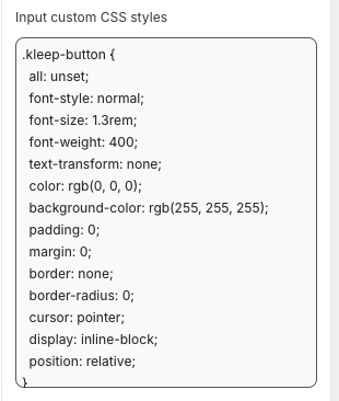
**Where to Add CSS**
In the Kleep App Embed settings, you’ll find an **“Input custom CSS styles”** field. Paste your custom CSS there.
Custom CSS Field
**Example Customization**
```css theme={null}
.kleep-button {
all: unset;
font-style: normal;
font-size: 1.3rem;
font-weight: 400;
text-transform: none;
color: rgb(0, 0, 0);
background-color: rgb(255, 255, 255);
padding: 0;
margin: 0;
border: none;
border-radius: 0;
cursor: pointer;
display: inline-block;
position: relative;
}
```
## 7. Multiple Environments
If you have multiple Shopify environments (dev, staging, production), you need to configure Kleep for each one.
**Setup for Each Environment**
1. **Production store** — Main store, fully configured
2. **Staging/Dev stores** — For testing before pushing to production
For each environment:
1. Install the Kleep app
2. Enable the App Embed
3. Contact your Kleep CSM to link the environment to your account
Always test changes on staging before applying to production.
**Environment-Specific URLs**
Provide your Kleep CSM with:
* Production URL: `https://www.yourbrand.com`
* Staging URL: `https://staging.yourbrand.com` (if applicable)
* Dev URL: `https://dev.yourbrand.com` (if applicable)
## 7.5 CTA Button & Similar Products — Full Installation Guide
For the complete technical reference on installing the Kleep CTA button and Similar Products feature (including all Liquid code, settings schema, and secondary button setup), refer to the dedicated guide below:
[CTA Button & Similar Products — Full Installation Guide](/cms/cta-button)
***
## 8. Vintage Themes - Size Guide Setup
Vintage themes (also called “legacy” or created before Online Store 2.0) don’t support App Blocks. Installation requires Liquid code modifications.
This section requires Shopify development knowledge (Liquid).
**Prerequisites**
* Access to the theme code editor (**Online Store → Themes → Edit code**)
* Kleep App Embed must be enabled in your Shopify admin (**Online Store → Themes → Customize → App embeds → Kleep**)
**Step 1: Enable the App Embed**
In your Shopify admin, go to **Online Store → Themes → Customize → App embeds** and toggle on the Kleep app.
**Step 2: Call the Snippet**
Paste the following code where you want Kleep to appear. It must be part of `Product info` block within `snippets` folder:
```jsx theme={null}
{% render 'kleep-button', cms: section.settings %}
```
**Step 3: Create the Button Snippet**
Create a new file named `kleep-button.liquid` within your `snippets` folder. Put the following content inside:
```jsx theme={null}
```
**Step 4: Add Settings Schema**
Add the following options to your Settings schema at the end of the section file:
```json theme={null}
{
"type": "header",
"content": "Button text",
"info": "If you enable this feature, the button text you enter will be replaced for all languages in your store"
},
{
"type": "checkbox",
"default": false,
"id": "custom_button_text_toggle",
"label": "Enable custom button text"
},
{
"type": "text",
"id": "custom_find_size_text",
"label": "Find my best size text",
"info": "What text will display instead of\"Find my best size\"?"
},
{
"type": "text",
"id": "custom_recommended_size_text",
"label": "Recommended size text",
"info": "What text will display instead of\"Recommended size\"?"
},
{
"type": "header",
"content": "Image"
},
{
"type": "url",
"id": "image_url",
"label": "Url Image"
},
{
"type": "range",
"id": "image_size",
"min": 0,
"max": 80,
"step": 2,
"unit": "px",
"label": "Image size (square)",
"default": 20
},
{
"type": "header",
"content": "CSS Styles"
},
{
"type": "checkbox",
"default": true,
"id": "default_font_family",
"label": "Theme font",
"info": "If checked, the css variable `--font-body-family` is used"
},
{
"type": "font_picker",
"id": "font_family",
"label": "Font Family",
"default": "helvetica_n4"
},
{
"type": "select",
"id": "text_style",
"label": "Text style",
"default": "normal",
"options": [
{ "label": "Normal", "value": "normal" },
{ "label": "Italic", "value": "italic" },
{ "label": "Oblique", "value": "oblique" }
]
},
{
"type": "select",
"id": "text_transform",
"label": "Text transformation",
"default": "none",
"options": [
{ "label": "Normal", "value": "none" },
{ "label": "Capitalize", "value": "capitalize" },
{ "label": "Uppercase", "value": "uppercase" },
{ "label": "Lowercase", "value": "lowercase" }
]
},
{
"type": "select",
"id": "text_weight",
"label": "Text weight",
"default": "400",
"options": [
{ "label": "100", "value": "100" },
{ "label": "200", "value": "200" },
{ "label": "300", "value": "300" },
{ "label": "400", "value": "400" },
{ "label": "500", "value": "500" },
{ "label": "600", "value": "600" },
{ "label": "700", "value": "700" },
{ "label": "800", "value": "800" },
{ "label": "900", "value": "900" }
]
},
{
"type": "range",
"id": "text_size",
"min": 2,
"max": 50,
"step": 2,
"unit": "px",
"label": "Font size",
"default": 16
},
{
"type": "checkbox",
"id": "text_underline",
"label": "Text underline",
"default": false
},
{
"type": "range",
"id": "text_underline_offset",
"min": 1,
"max": 20,
"step": 1,
"unit": "px",
"label": "Underline offset",
"default": 2
},
{
"type": "color",
"id": "text_color",
"label": "Button text color",
"default": "#ffffff"
},
{
"type": "color",
"id": "bg_color",
"label": "Background color",
"default": "#000000"
},
{
"type": "color",
"id": "border_color",
"label": "Border color",
"default": "#000000"
},
{
"type": "range",
"id": "border_width",
"min": 0,
"max": 8,
"step": 1,
"unit": "px",
"label": "Border width",
"default": 0
},
{
"type": "header",
"content": "Spacing"
},
{
"type": "checkbox",
"id": "center",
"label": "Center the button",
"default": false,
"info": "This will override 'Horizontal margin'"
},
{
"type": "range",
"id": "margin_y",
"min": 0,
"max": 80,
"step": 2,
"unit": "px",
"label": "Vertical margin",
"default": 0
},
{
"type": "range",
"id": "margin_x",
"min": 0,
"max": 80,
"step": 2,
"unit": "px",
"label": "Horizontal margin",
"default": 0
},
{
"type": "range",
"id": "padding_t",
"min": 0,
"max": 40,
"step": 2,
"unit": "px",
"label": "Padding top",
"default": 12
},
{
"type": "range",
"id": "padding_r",
"min": 0,
"max": 40,
"step": 2,
"unit": "px",
"label": "Padding right",
"default": 16
},
{
"type": "range",
"id": "padding_b",
"min": 0,
"max": 40,
"step": 2,
"unit": "px",
"label": "Padding bottom",
"default": 12
},
{
"type": "range",
"id": "padding_l",
"min": 0,
"max": 40,
"step": 2,
"unit": "px",
"label": "Padding left",
"default": 16
},
{
"type": "range",
"id": "border_radius",
"min": 0,
"max": 40,
"step": 2,
"unit": "px",
"label": "Border radius",
"default": 0
}
```
**Step 5: Validate**
Validate updates in the Shopify Theme Customize area. Configure visuals within product information block settings.
**Optional: Secondary Button**
If you want to add a secondary button, create a new file named `kleep-secondary-button.liquid` within your `snippets` folder:
```jsx theme={null}
```
Paste the following code where you want Kleep to appear. It must be part of `Product info` block within `snippets` folder.
```jsx theme={null}
{% render 'kleep-secondary-button', cms: section.settings %}
```
***
## 9. Vintage Themes - Similar Products Setup
**Step 1: Create the Snippet**
Create a file `snippets/kleep-similar-button.liquid` with the following code:
```jsx theme={null}
{% assign cms = block.settings %}
{% assign domain = shop.domain %}
{% assign translated_similar = '' %}
{% assign translated_similar_missing = true %}
{%- assign domain_key = domain | prepend: 'www.' | append: '.recommended' -%}
{% assign raw_domain_similar = domain_key | t %}
{% unless raw_domain_similar contains 'Translation missing'
or raw_domain_similar contains domain
%}
{% assign translated_similar = raw_domain_similar %}
{% assign translated_similar_missing = false %}
{% endunless %}
{%- if translated_similar_missing -%}
{% assign raw_global_similar = 'kleep.recommended.text.btn' | t %}
{% unless raw_global_similar contains 'Translation missing' %}
{% assign translated_similar = raw_global_similar %}
{% assign translated_similar_missing = false %}
{% endunless %}
{%- endif %}
```
**Step 2: Render the Snippet**
Insert this line wherever you want the button to appear:
```jsx theme={null}
{% render 'kleep-similar-button' %}
```
Typical placement: under the variant selectors or near the Add to Cart form.
**Step 3: Enable the Correct Mode**
Because vintage themes cannot insert OS 2.0 blocks, the widget must use one of:
* `custom_buttons`
* `popup+custom`
* `button+custom`
**Adding Multiple Buttons**
To create multiple buttons, simply place the snippet code in different areas of the product template:
```jsx theme={null}
{% render 'kleep-similar-button' %}
```
Each snippet call creates an additional button. Every button automatically appears only when the selected variant is out of stock.
***
## 10. Translations (i18n)
Add the following translations to your theme locale files.
**English (`en.json`)**
```json theme={null}
{
"kleep": {
"button": {
"text": {
"without_hash": "Find my ideal size",
"with_hash": "Ideal size"
}
},
"recommended": {
"text": {
"btn": "View similar",
"hint": "Size unavailable",
"link": "See similar products"
}
},
"search": {
"text": {
"inputPlaceholder": "Search...",
"productsBlockTitle": "Products",
"clearButton": "Clear"
}
},
"searchPage": {
"text": {
"header": "search results",
"query": "Results for",
"submit": "Search",
"input": "Search the store",
"viewProduct": "View product"
}
}
}
}
```
**French (`fr.json`)**
```json theme={null}
{
"kleep": {
"button": {
"text": {
"without_hash": "Trouver ma taille idéale",
"with_hash": "Taille idéale"
}
},
"recommended": {
"text": {
"btn": "Voir similaire",
"hint": "Taille indisponible",
"link": "Voir des produits similaires"
}
},
"search": {
"text": {
"inputPlaceholder": "Recherche...",
"productsBlockTitle": "Produits",
"clearButton": "Effacer"
}
},
"searchPage": {
"text": {
"header": "résultats de la recherche",
"query": "Résultats pour",
"submit": "Recherche",
"input": "Rechercher dans la boutique",
"viewProduct": "Voir le produit"
}
}
}
}
```
**Italian (`it.json`)**
```json theme={null}
{
"kleep": {
"button": {
"text": {
"without_hash": "Trova la mia taglia ideale",
"with_hash": "Taglia ideale"
}
},
"recommended": {
"text": {
"btn": "Visualizza simili",
"hint": "Taglia non disponibile",
"link": "Visualizza prodotti simili"
}
},
"search": {
"text": {
"inputPlaceholder": "Cerca...",
"productsBlockTitle": "Prodotti",
"clearButton": "Cancella"
}
},
"searchPage": {
"text": {
"header": "risultati della ricerca",
"query": "Risultati per",
"submit": "Cerca",
"input": "Cerca nel negozio",
"viewProduct": "Visualizza prodotto"
}
}
}
}
```
**German (`de.json`)**
```json theme={null}
{
"kleep": {
"button": {
"text": {
"without_hash": "Finde meine ideale Größe",
"with_hash": "Ideale Größe"
}
},
"recommended": {
"text": {
"btn": "Ähnliche Ansicht",
"hint": "Größe nicht verfügbar",
"link": "Ähnliche Produkte ansehen"
}
},
"search": {
"text": {
"inputPlaceholder": "Suchen...",
"productsBlockTitle": "Produkte",
"clearButton": "Klar"
}
},
"searchPage": {
"text": {
"header": "Suchergebnisse",
"query": "Ergebnisse für",
"submit": "Suchen",
"input": "Durchsuchen Sie den Shop",
"viewProduct": "Produkt ansehen"
}
}
}
}
```
**Spanish (`es.json`)**
```json theme={null}
{
"kleep": {
"button": {
"text": {
"without_hash": "Encontrar mi talla ideal",
"with_hash": "Talla ideal"
}
},
"recommended": {
"text": {
"btn": "Ver similares",
"hint": "Talla no disponible",
"link": "Ver productos similares"
}
},
"search": {
"text": {
"inputPlaceholder": "Buscar...",
"productsBlockTitle": "Productos",
"clearButton": "Borrar"
}
},
"searchPage": {
"text": {
"header": "resultados de búsqueda",
"query": "Resultados para",
"submit": "Buscar",
"input": "Buscar en la tienda",
"viewProduct": "Ver producto"
}
}
}
}
```
**Japanese (`ja.json`)**
```json theme={null}
{
"kleep": {
"button": {
"text": {
"without_hash": "自分に合うサイズを探す",
"with_hash": "好みのサイズ"
}
},
"recommended": {
"text": {
"btn": "類似商品を見る",
"hint": "サイズがありません",
"link": "類似商品を見る"
}
},
"search": {
"text": {
"inputPlaceholder": "検索...",
"productsBlockTitle": "商品",
"clearButton": "クリア"
}
},
"searchPage": {
"text": {
"header": "検索結果",
"query": "検索結果",
"submit": "検索",
"input": "ストアを検索",
"viewProduct": "商品を見る"
}
}
}
}
```
**Korean (`ko.json`)**
```json theme={null}
{
"kleep": {
"button": {
"text": {
"without_hash": "내 이상적인 사이즈 찾기",
"with_hash": "추천 사이즈"
}
},
"recommended": {
"text": {
"btn": "유사한 상품 보기",
"hint": "사용 불가",
"link": "유사한 상품 보기"
}
},
"search": {
"text": {
"inputPlaceholder": "검색...",
"productsBlockTitle": "상품",
"clearButton": "지우기"
}
},
"searchPage": {
"text": {
"header": "검색 결과",
"query": "다음에 대한 결과",
"submit": "검색",
"input": "매장 검색",
"viewProduct": "상품 보기"
}
}
}
}
```
**Portuguese (`pt.json`)**
```json theme={null}
{
"kleep": {
"button": {
"text": {
"without_hash": "Encontrar meu tamanho ideal",
"with_hash": "Tamanho recomendado"
}
},
"recommended": {
"text": {
"btn": "Ver similar",
"hint": "Tamanho indisponível",
"link": "Ver produtos similares"
}
},
"search": {
"text": {
"inputPlaceholder": "Pesquisar...",
"productsBlockTitle": "Produtos",
"clearButton": "Limpar"
}
},
"searchPage": {
"text": {
"header": "resultados da pesquisa",
"query": "Resultados para",
"submit": "Pesquisar",
"input": "Pesquisar na loja",
"viewProduct": "Ver produto"
}
}
}
}
```
***
## 11. Technical Reference
**CTA Location on PDP**
The location is defined by DOM selectors inside `KleepSDK.getConstants()`:
* **`targetProductInfoBlockQueries`** – Array of selectors pointing to the main container of product details (title, price, sizes, etc.). The script iterates through these selectors and uses the first one it finds as the insertion point for the CTA or popups.
* **`targetVariantQueries`** – Where size/variant options are. Once the product info block is found, the script searches inside it for variant elements (like size selectors). Each variant `
 Similar Products Mode Selection
**Adding Custom Buttons (for custom modes)**
If you’ve chosen a mode with “custom”, you can add buttons at specific locations:
1. Go to the **Product page** template in the theme editor
2. In the desired section, click **Add block**
3. Click the **Apps** tab and select **“Kleep Similar Button”**
4. Position the block where you want it and save
Similar Products Mode Selection
**Adding Custom Buttons (for custom modes)**
If you’ve chosen a mode with “custom”, you can add buttons at specific locations:
1. Go to the **Product page** template in the theme editor
2. In the desired section, click **Add block**
3. Click the **Apps** tab and select **“Kleep Similar Button”**
4. Position the block where you want it and save
 Add Kleep Similar Button Block
 Enable Custom Search
**Step 2: Access the Search Template**
In the theme editor, click the dropdown menu at the top (defaults to “Home page”) and select **“Search”** from the template list.
Enable Custom Search
**Step 2: Access the Search Template**
In the theme editor, click the dropdown menu at the top (defaults to “Home page”) and select **“Search”** from the template list.
 Select Search Template
**Step 3: Hide the Native Search**
In the Template section, hide or remove the native **“Search results”** block by clicking the eye icon.
Select Search Template
**Step 3: Hide the Native Search**
In the Template section, hide or remove the native **“Search results”** block by clicking the eye icon.
 Hide Native Search
**Step 4: Add the Kleep Search Block**
Click **Add section**, then in the **Apps** tab, select **“Search”** (kleep-dev).
Hide Native Search
**Step 4: Add the Kleep Search Block**
Click **Add section**, then in the **Apps** tab, select **“Search”** (kleep-dev).
 Add Kleep Search Block
**Step 5: Configure Options**
Click the Search block you added to access settings: number of results, grid/list display, search delay, etc.
Add Kleep Search Block
**Step 5: Configure Options**
Click the Search block you added to access settings: number of results, grid/list display, search delay, etc.
 Search Configuration Options
## 4. Returns Integration (Optional)
If you use a returns management platform, Kleep can integrate return data to improve size recommendations.
**Supported Returns Providers**
* Global-e
* Aftership
* Fast Return
* Return Go
* Other (contact us)
**Configuration**
1. In the Kleep Dashboard, go to **Settings → Returns**
2. Select your returns provider
3. Follow the provider-specific instructions to connect your account
Search Configuration Options
## 4. Returns Integration (Optional)
If you use a returns management platform, Kleep can integrate return data to improve size recommendations.
**Supported Returns Providers**
* Global-e
* Aftership
* Fast Return
* Return Go
* Other (contact us)
**Configuration**
1. In the Kleep Dashboard, go to **Settings → Returns**
2. Select your returns provider
3. Follow the provider-specific instructions to connect your account
 Custom CSS Field
**Example Customization**
Custom CSS Field
**Example Customization**